This post is a part of the Xamarin July series where various Xamarin Community contributors publish posts about Xamarin UI.
In this post we will explore how to create a bottom sheet or drawer interaction that is used to complement your main app page. These are similar to half modal pages - but can be of varying lengths. The iOS Maps app and Siri Shortcuts are two out of the box applications that utlize this custom control by Apple to display information contextually.
A similar control is also found in the Google Maps app on both Android and iOS versions - making it a viable design pattern for either platform. I did my best to avoid using custom renderers - which usually requires some domain knowledge of each specific platform.

Slide drawer in iOS Maps
Use Cases
A bottom sheet is useful in cases when trying to bring relevant content into the main view. For example - in the Siri shortcuts app the drawer is used to search hundreds of possible functions to help pick the right one.
In the maps example, the drawer is used to search through thousands of places and bring the one that you care about into view.
A good way to think of use cases is by considering applications that begin with searching or filtering as the first step and the things the user may filter on can be large in number or different everytime they open your app.

A bottom sheet is used for landmark details
Getting Started
For our sample application - we will create a recipes app that allows us to find recipes by ingredients. We will use the bottom sheet to filter out the recipes we want by ingredient.
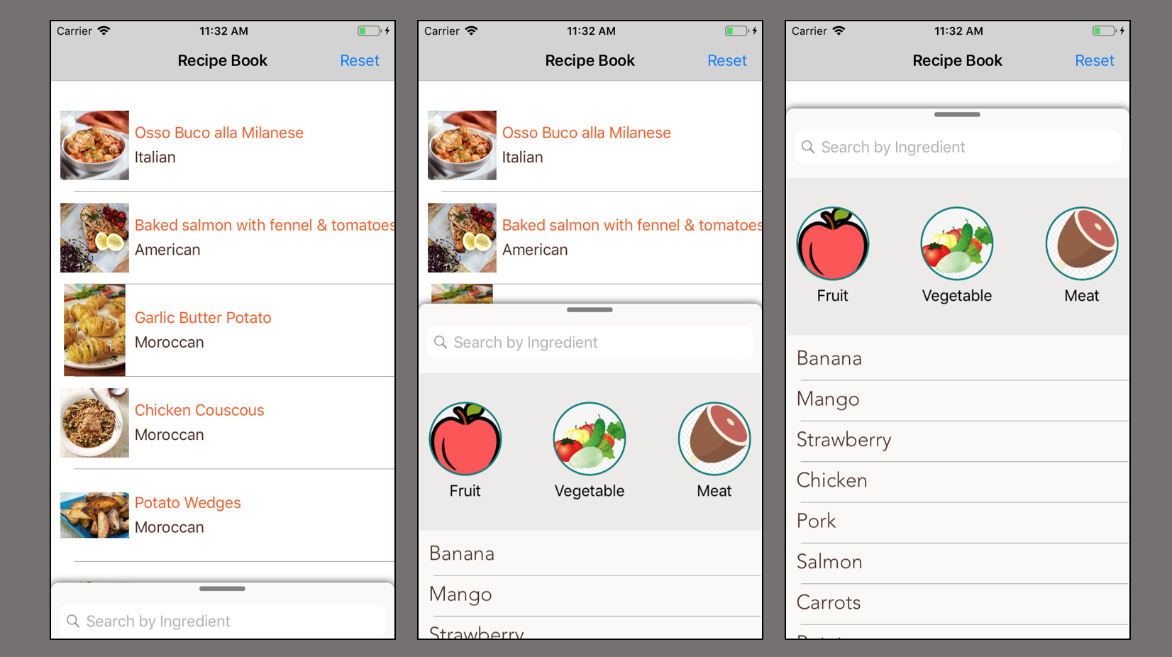
1. Set up our App Template
Our application just needs one page. We can modify the MainPage.xaml and it’s codebehind for our app. A simple Listview with an ImageCell can be used to show our big list of recipes. You can reuse my Listview source data here.
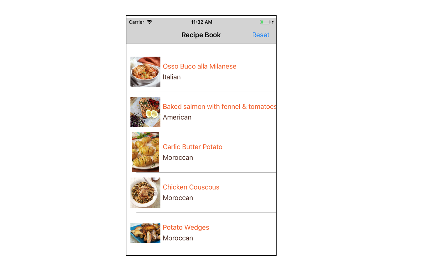
2. Preparing for our Bottom Sheet Control
Before we add our Bottom Sheet control - we should wrap the contents of our MainPage in a RelativeLayout. The Relative Layout is important to our application because it will allow us to overlay elements. In our case, we will overlay our Bottom Sheet Control over the rest of the page.
You can read more about RelativeLayouts on the Xamarin Docs Page.
3. Creating the Bottom Sheet Control
We are ready to begin building out bottom sheet control. It needs to look something like this.
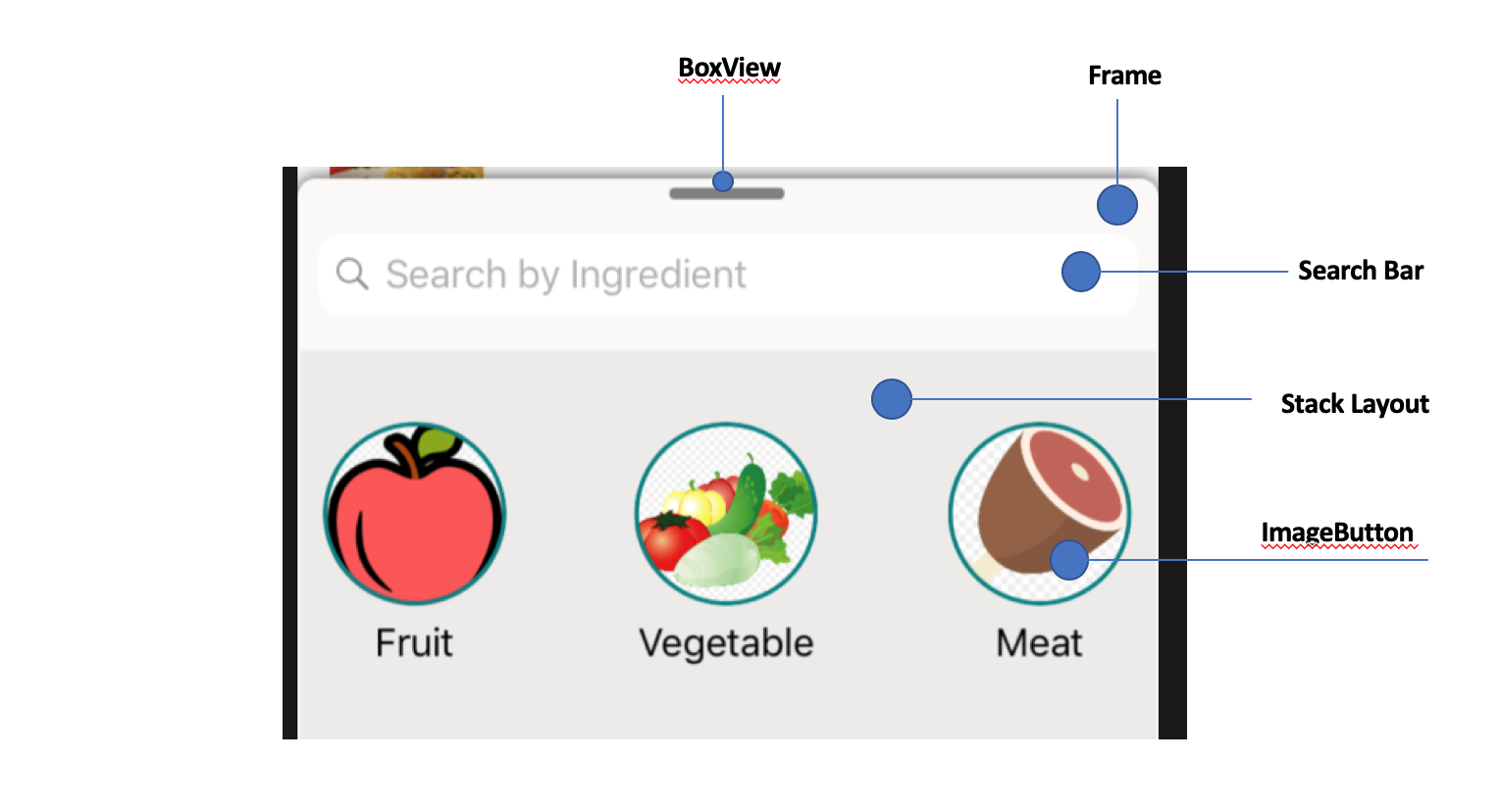
In our MainPage - we can start off by creating a Frame. Frames are nice because they can have rounded corners and shadows.
<Frame x:Name="bottomSheet" HasShadow="true" CornerRadius="8" Padding="1,4,1,0" BackgroundColor="#faf9f8"
RelativeLayout.YConstraint="{ConstraintExpression Type=RelativeToParent,Property=Height,Factor=.9,Constant=0}"
RelativeLayout.WidthConstraint="{ConstraintExpression Type=RelativeToParent,Property=Width,Factor=1,Constant=0}"
RelativeLayout.HeightConstraint="{ConstraintExpression
 Type=RelativeToParent,Property=Height,Factor=1,Constant=0}">
 </Frame>
We can use RelativeLayout Constraints to overlay our sheet view on top of the the content behind it.
We can make our sheet look nicer by adding a StackLayout. Add a SearchBar and ListView within the Layout to make it feel more familiar.
<SearchBar x:Name="SearchBox" BackgroundColor="Transparent"/>
<ListView BackgroundColor="Transparent" HorizontalOptions="FillAndExpand" HeightRequest="400">
</ListView>
At the beginning of your StackLayout we can also add a BoxView that is designed to mimic a handle. This will suggest to users that they can drag this sheet out.
<BoxView HeightRequest="5" CornerRadius="2" WidthRequest="50" BackgroundColor="Gray" HorizontalOptions="Center"/>
I went a step further and also added a grid view in between the SearchBar and Listview. The final element code is on Github.
4. Bringing our Sheet to Life
Our sheet can be brought to life using a PanGestureRecognizer. We can add this recognizer directly to our Frame.
<Frame.GestureRecognizers>
    <PanGestureRecognizer PanUpdated="OnPanUpdated" />
</Frame.GestureRecognizers>
We will also create a function in the code behind to get our Pan Gesture Recognizer working. The Pan Gesture Event has two states Running and Completed.
double x,y;
void OnPanUpdated(object sender, PanUpdatedEventArgs e)
{
    // Handle the pan
    switch (e.StatusType)
    {
        case GestureStatus.Running:
        break;
        case GestureStatus.Completed:
            y = bottomSheet.TranslationY;
        break;
    }

}
We can add the following line of code to the running case - this will animate our frame as if it was sliding up and down. This animates the frame everytime our finger moves over the frame.
 case GestureStatus.Running:
    var translateY = Math.Max(Math.Min(0, y + e.TotalY), -Math.Abs((Height * .15) - Height));
    bottomSheet.TranslateTo(bottomSheet.X, translateY, 10);
 break;
translateY contains the pixel amount the Frame needs to be moved by in order to move up or down.
The translateY assignment has a lot going on. In fact - I stole it from the Pan Gesture sample. Confusing at first, but elegant once you realize what’s going on.
We can think of the code above as a more elegant way of writing something like this.
//check the intended translation in relation to the page and if it's valid
if(y+e.TotalY < 0 || y+e.TotalY > this.Height )
//intended translation less than 0, return the minimum
if(y+e.TotalY < 0) return 0;
//intended translation more than page height, return the maximum page height
if(y+e.TotalY > this.Height) return Height;
When using the Pan Gesture recognizer, we should be aware of the view stays within the page bounds. We want to avoid translating our view outside the screen. We don’t want to push the view off screen or else we can’t get it back. So we need to do some bounds checking and validate the pan translation amount is actually valid.
The max function can be utilized to distinguish whether it’s a Pan Up or Down Gesture.
Panning up gestures usually have negative translateY coordinates. Since our control starts at the bottom of the screen, the absolute value of the up translation can’t be greater than the entire screen Height iteself.
Since our bottom sheet should only go up to 85% of the entire view - we want this control to always be less than 75% of the entire screen. That’s how we get this:
-Math.Abs((Height * .15)
The translation portion is the key to the entire view. There are a few other functions that we use as well. I won’t explain them too much here, but the code should make it clear. Take a look the final code starting here.
Assuming everything is in place and the helper functions exist, we can interact with our sheet and begin to experience the different lock states.
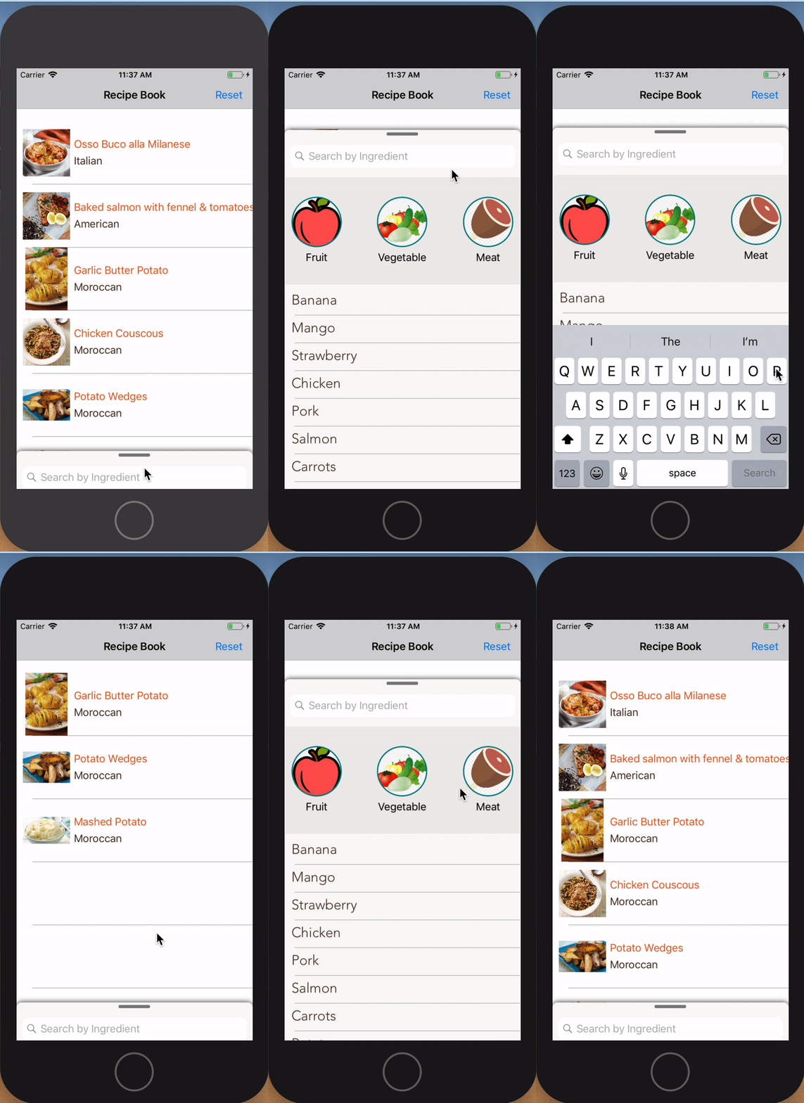
Our Final App
5. Accounting for Edge Cases
Using the Searchbar and other keyboard inputs means that this control has to open up fully. However, since the view is not part of a traditional ScrollView, we have to tap into some events to programatically pull out the drawer.
We can do this by tapping into the Focused event on the Searchbar.
void SearchBar_Focused(object sender, FocusEventArgs e)
{
    //open sheet to 85% of the view
     var finalTranslation = Math.Max(Math.Min(0, -1000), -Math.Abs(getProportionCoordinate(.85)));
     bottomSheet.TranslateTo(bottomSheet.X, finalTranslation, 150, Easing.SpringIn);
}
Final Interface
I didn’t break up my view into it’s own separate control. However, with a few tweaks - it can be isolated as it’s own control.
Take a look at the following methods in my final source code. These are the ones you should care about when isolating the view.
 double x, y;

 void SearchBar_Focused(object sender, FocusEventArgs e)

 void OnPanUpdated(object sender, PanUpdatedEventArgs e)

 public bool isSwipeUp(PanUpdatedEventArgs e)

 public double getClosestLockState(double TranslationY)

 public double getProportionCoordinate(double proportion)

 void dismissBottomSheet()

 void openBottomSheet()
Hopefully, everything made sense and all the links work as expected. You can also leave a comment and I will be happy to answer any additional questions.

